Thursday, September 15, 2011

Chapter 7 Translating the Layered Designs into Embroidery


Sample #1:
I had to re-work the following design as on my first attempt I had used the original design straight from the source instead of using a design based upon it. The following is my own design based upon the source material. I think the penny dropped with this exercise!


Tuesday, May 31, 2011

Colour Study


I decided to re-present the fabrics I dyed previously in order to create a colour wheel. I began by painting a page in my sketch book with my new box of Koh-I-Noor waterbased dye paints, waited for them to dry and then arranged in descending order all the cut and frayed fragments of fabric, sewing them to the page. Next time I am sewing a sample to Pink Pig sketchbook paper I shall put on a thimble!!

Later I had lots of fun painting a few pages with washes of Brusho paints, another new acquisition. I really like the colour effects of the Brusho paints, and was able to mix up the exact shade I wanted to match the coral pearl cotton thread used in sample #1 below, by combining orange with a touch of brilliant red. It's just like playing with dyes but without any of the hassle of washing out fabric afterwards!

Chapter 7: Translating Designs into Embroidery - Sample # 1


I was very excited to begin working on this chapter as it is the beginning of the incorporation of stitching!
Since each sample takes some time to complete I have decided to post each sample as it is finished. I also wanted to try out a new way of presenting my design work. With this in mind I am going to present the work in 2 separate sketchbooks / textile journals - one for the actual design and sketching work, and the other for the stitched samples. This is partly due to the fact that I have always wanted to create my very own book of stitched samples, probably as a legacy to the tiny little sewing sample books we made in primary school! This chapters focus seemed to offer the perfect opportunity!

I found the design for this sample in the book 'The Goddesses and Gods of Old Europe' by Marija Gimbutas. It is a motif from a vase found in a Slovakian cemetry and dating from the late Cucuteni period.

The background fabric was cut from hand-dyed cotton poplin. The first layer is a hand-painted silk organza, and the second layer is a scrap of nylon chiffon.

The motif was outlined in stem stitch using a pearl cotton thread, and further stitching incorporated running stitch using pearl cotton, a wool/mohair blend, and thick and thin rayon threads. It's definitely easier to stitch with cotton than rayon!

Saturday, May 28, 2011

Chapter 6: Use of Bonding in Appliqué


The transfer adhesive I used for all of the sample above was Bondaweb.
The first 2 samples were created by ironing the Bondaweb to the back of the fabrics to be cut into the chosen design shapes, based on previous cut and fold design work. The primarily yellow motif was backed on to hand-dyed purple cotton poplin, followed by the next cut layer of yellow hand-dyed cotton. The 3rd layer was a shiny orange polyester. At this stage the whole motif was far too bright, brash and loud, so in order to tone it down I applied a 4th layer of violet coloured nylon organza.

The 2nd orange motif was started upon a background of hand-dyed cotton poplin, followed by a Bondaweb backed and cut heavy orange polyester satin. This was topped by a layer of hand-dyed and stamped silk organza. At this point the design lacked a central focus so I cut a small diamond shaped piece of shiny polyester and stuck it into the middle of the motif.
Of the 2 designs I preferred the first one, mainly because the colours worked better together.

The next 2 samples were ones I really enjoyed creating. It was exciting painting the Bondaweb and I can see that this technique will have lots of interesting applications in future work! I painted the Bondaweb with Jacquard Dye-na-Flow paints in the colours Periwinkle, #812, and Violet, #811. For the first shape I cut the design from the Bondaweb when it was dry; for the 2nd I tore it. I prefer the more organic effect of the torn piece. Both were applied to a lightly dyed cotton background. I then sprinkled lots of little bits and pieces of fabrics and threads on to the adhesive shape, and then covered the first sample with netting, and the 2nd with nylon chiffon. While I prefer the torn appearance of the 2nd motif, I actually prefer the colour combinations of the 1st piece, because of the greater variety of colours.

The next sample used gold Bondaweb-backed tissue paper instead of fabric. I crumpled the paper before adhering the Bondaweb to it to give added texture. Because the gold was so bright I felt it needed a very dark background to show up against so I chose a piece of dark violet rayon I dyed some time ago. I really like the overall effect of this sample, and can see lots of possibilities for using more tissue paper in the future, and not just for design work!

The next 2 samples are decorative bonded fabrics. Both used a background of handpainted cotton, the purple design using painted Bondaweb, while the orange design used unpainted web. For both pieces I sprinkled lots and lots of tiny pieces of fabrics, threads and ribbons, also threads pulled from pieces of organzas, on to the webbed fabric. Then the pieces were covered with nylon chiffon scarves whose colous co-ordinated with the background fabrics. I also made a 2nd smaller piece in the same coour way as the orange sample for use in the next stage of this chapters work, although for this smaller sample I used longer pieces of threads and larger bits of cut and torn fabrics, which creates a very different effect, less subtle and blended, more obvious. Which approach I might choose in the future would depend upon the effect I was seeking.

The final 2 samples show first the fabric mentioned above, followed by the motif which was cut from an adhesive bonded sample, and applied to the dark rayon fabric used above in the gold tissue sample. I think that this created fabric looked better as part of a cut and fold design than it did as a pice of fabric alone.

All in all I enjoyed creating all these samples for this chapters assignments, and can visualize lots of uses for new techniques learned.

Chapter 6: Use of Bonding in Appliqué

Thursday, May 26, 2011

Chapter 5: Decorating Fabric


Using the rubber stamp from a previous exercise and textile paints, I stamped a small selection of fabrics, including some cottons, rayon, nylon organza, and a small unidentifiable piece of fabric!

Textile paints used were all from Jacquard:
-Jacquard Textile Color #103 Orange
-Jacquard Textile Color #124 Yellow Ochre
-Jacquard Luniere #564 Super Copper.

Chapter 5: Fabric Selection


After trawling through my fabric stash I selected a range of fabrics in my chosen colour scheme, all of which I had hand-dyed previously, except for the nylon and novelty fabrics. The various types of fabrics included a range of cottons - cotton poplin, cotton lawn and muslins; some linen and rayon; a selection of silks, including wild silk, silk organza, and silk chiffon; and finally a few nylon organza and novelty fabrics, and nylon chiffon scarves.
Next I ironed and organized them into 2 broad groups based upon my colour scheme - blue/violets and yellow/oranges.

Tuesday, May 24, 2011

Chapter 4: Cut + Fold Designs in Coloured Papers


The images above are a series of 10cm x 10 cm design variations, using several layers of dyed and painted papers, cut into various shapes and based upon previous design work, as illustrated in black cut + fold design work. Of all the cut and fold exercises this was the most interesting to work upon as after initially keeping to original design work, I then began to cut extra shapes here and there, in essence to play! It was fun!

Chapter 4: More Cut + Fold Variations


This next set of cut and fold variations are based upon another pottery motif, this time dating from the 6th. millenium B.C. I enjoyed creating this second set of variations more than the first set because the initial design motif was slightly more intricate, and also because I had gained a little bit of experience creating the first set! The design sheets are A4 in size.

Chapter 4: Cut + Fold Design Shapes in Black Paper


The cut and fold variations above are all based upon one single design source, as noted above - a motif from a Romanian dish, dating from the 5th. millenium B.C.

Each design sheet above is A4 sized.

Sunday, March 27, 2011

Chapter 3 : Design Sheet C


I decided to experiment a little more with this Design Sheet, moving away from the painted cartridge paper used before for backgrounds in previous design sheets.

I began by crumbling some brown wrapping paper a few times, unrolling it and re-crumbling between my hands. Then I painted it with a combination of Brusho paints mixing purple and blue, letting the colours blend and separate at will. I love how the colours deepened in the foldlines of the paper, creating a very rich background.

The motifs were cut from cartridge paper which had paint poured upon it in layers, then lifted to allow the wet paint to merge with the colour below.

Another technique I applied was to paint a very wet surface on cartridge paper, then sprinkle some sea salt upon it, creating a very textured and interesting paper.

All the design units were cut from the last 2 sheets. It was definitely a whole lot more exciting to create these design units from more interesting papers.

Description and explanation of Design Sheet C:
[A4 sized to ease scanning in computer]

(i) Complex counterchange: I cut out 2 star shapes exactly the same,using 1 each of the papers described above. Next I drew the star shapes on the backs of the papers. I then divided and cut each star into quarters, before arranging them into a counterchange pattern.

(ii) Divide and Separate - new motif selected. Star shape as in (i) only slightly more complex, and rearranged after cutting out, leaving a slight gap between each piece. New motif outlined in white above.

(iii) New unit overlapping in an edge to edge repeat pattern.

(iv) Symmetrical design, based on new motif.

(v) Interlocked motifs, symmetrically arranged.

(iii), (iv) and (v) above all display interesting negative space shapes, especially the slightly off-centered shapes visible in (iv) and (v).

Friday, March 18, 2011

Dyeing a Colour Wheel


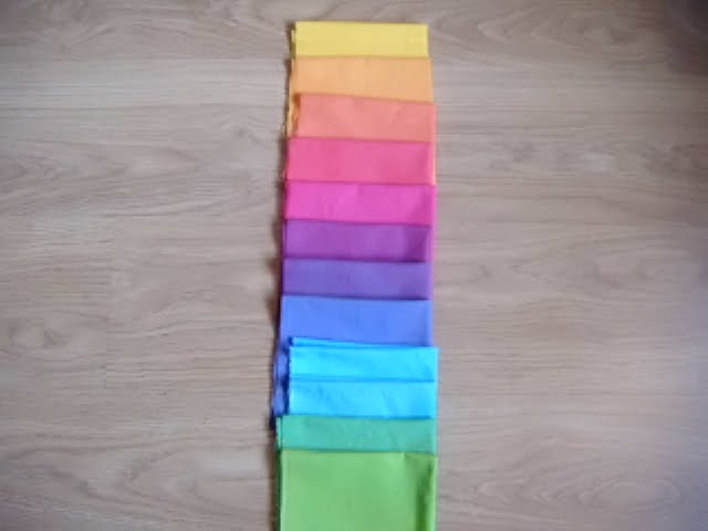
In anticipation of some of the colours I will soon need for later chapters in this module, I decided to dye a 12 step colour wheel, based on the 3 primary colours of magenta, turquoise and lemon yellow.

The actual Procion MX colour numbers were :
Vibrant Magenta MX-8B
Brilliant Turquoise MX-G
Lemon Yellow MX-4G

I purchased them online from Fibrecrafts, from whom I always receive excellent service.

I dyed the cotton poplin fabric, purchased from Whaleys and prepared for dyeing, following the instructions given in the book 'Dyeing to Quilt' by Joyce Mori and Cynthia Myerberg, basing my wheel on set # 2 colour wheel on page 29 of the book. This palette is sometimes called the 'jewel palette' because of the brightness of its colours. Each piece of fabric measures about 11'' x 18'', a decent enough size to be useful in projects! Each piece was presoaked in soda ash, dyed in a plastic cup and then cured overnight in a plastic bag.

The actual amount of dye used to create each colour was as follows:
#1: 60ml Magenta
#2: Red/Orange - 40ml magenta + 20ml yellow
#3: Orange - 10ml magenta +50ml yellow
#4: Yellow/orange - 2.5mlml magenta + 57.5ml yellow
#5: Yellow - 60ml yellow
#6: Yellow/green - 50ml yellow + 10ml turquoise
#7: Green - 20ml yellow + 40ml turquiose
#8: Blue/green - 57.5ml turquoise + 2.5ml yellow
#9: Turquoise - 60ml turquoise
#10: Blue/violet - 10ml red + 50ml turquoise
#11: Violet - 30ml magenta + 30ml turquoise
#12: Red/violet - 50ml magenta + 10ml turquoise

Numbers 4 and 11 are my chosen colour scheme for this section.

The fabrics above are laid out to show the progression of colours. I also set them up side by side, with each colour lying alongside its complementary colour, eg violet and yellow.

You can also see a pile of scrims and muslin dyed in the same colour progression, followed by a few pieces of scrim which were used to wipe up spills. They are almost the most interesting of all, simply because they are so variegated and colourful! Since I love scrim fabric so much, finding it to be infinitely useful, I never have a dyeing session without also including some scrim in the mix! You can never have too much scrim in your fabric collection! Better than crayons!!

Chapter 3: Design Sheet B


Design Sheet B was created on A3 size background, painted sheet.Using coloured papers in the same colour scheme as Design Sheet A, I cut squares of paper about 6cms wide. I adapted the star shape used in Design Sheet A to create new shapes and designs.
(i) Large and small version of same shape combined to create a new star shape
(ii)Edge-to-edge repeat pattern using 2 sizes of star shape
(iii)Repeat border and corner pattern using 2 sizes of star shape
(iv) Linking border pattern using different shapes
(v) Linking 2 different shapes
(vi)A new shape created from an old shape

Comments: I loved creating this design sheet as it felt a whole lot more lively to me than Design Sheet A. If I was doing it again I would use a more interesting, variegated and mottled background, and perhaps even more varied shades, tints and tones for the foreground colours. Repeat patterns 2 +3 were the most interesting to design.

Wednesday, January 12, 2011

CHAPTER 3: DESIGN DEVELOPMENT


CHAPTER 3: DESIGN DEVELOPMENT BASED ON THE STAR OR CROSS

DESIGN SHEET A

(i) COUNTERCHANGE: negative and positive shapes side by side
(ii) POSITIVE AND NEGATIVE:[INTERCHANGE] 4 star shapes in a square, touching each other so that a third shape is formed.
(iii) SYMMETRY: A symmetrical star shape, with lines of symmetry drawn through the shape
(iv) ASYMMETRY: The line of symmetry is no longer in a central position.Star shape doubly asymmetrical.
(v)DISTORTION:Star shape re-designed within different outline shapes -- circle, diamond and triangle.
(vi)PERSPECTIVE DISTORTION
(VII) REPEAT PATTERN: based on triangle shape.